 Frame of Mind
Get a Quote
Frame of Mind
Get a Quote
Frame of Mind
Get a Quote
Frame of Mind
Get a Quote
6 min read · April 2026
Choosing the right frame is equal parts medium, context and room. The frame should support the artwork, not fight it. Here is how we approach it in the studio.
A pencil drawing on 200gsm paper wants something different to a thick oil on canvas. Works on paper almost always benefit from glass and a mat. Canvas usually works raw, or with a deep shadow box. Photographs sit somewhere in between.
Walk around the space with the piece under your arm. Light, wall colour, ceiling height and adjacent furniture all affect the frame choice more than people think. A dark walnut frame in a sun-filled white room draws the eye; the same frame in a book-lined study disappears.
The larger the work, the chunkier the profile can go. A slim 14mm profile on an A1 print looks lost. A chunky 34mm profile on an A5 piece looks over-designed. When in doubt, step up one size from where you instinctively land.
A mat gives the artwork breathing room and separates it from the glass. Works on paper almost always benefit. Canvas never needs one. If the paper has a beautiful deckle edge, float mount it instead of covering the edge with a window mat.
Good framing disappears. The frame should be the last thing a viewer notices.
Natural oak is safe and works with almost everything. Dark walnut adds gravity and warmth. Black is modern and sharp. Whitewash suits minimalist rooms. Custom stains get personal: a dusty rose, a forest green, a deep blue. If the piece itself has a dominant colour, picking it up in the frame stain is a classic move.
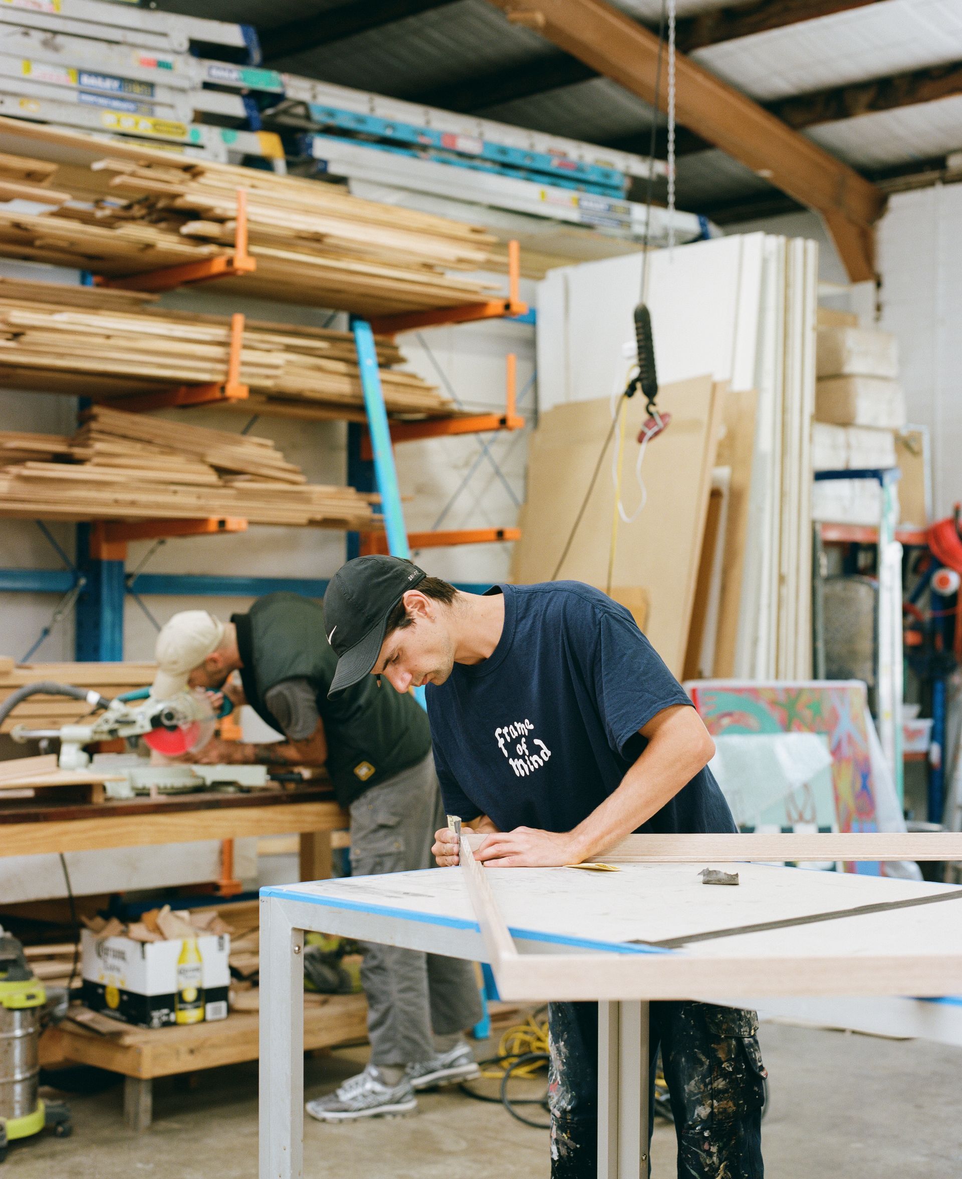
Ninety percent of framing decisions get easier once the piece is in your hands at our sample bench. Bring it by. We will pull stain blocks, profile mock-ups and mat samples up next to it. No obligation.
Thanks for reading
Get a Free Quote